Htag
On FontsInUse
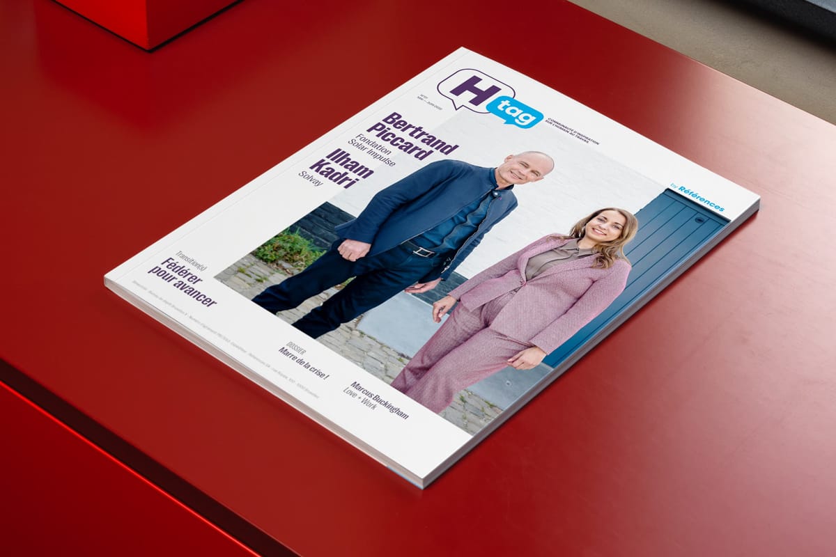
In the digital age, this paper medium is intended to be of high quality, both in terms of content and form. This project stands out from the usual landscape of professional magazines with an assertive editorial design, inspired by the codes of the B2C sector. The attention paid to framing the reading, its fluidity and its rhythm through striking visual elements and careful graphic details, makes it possible to guide the reader through rich content, to structure the space and to make the experience engaging.
The editorial design is based on a grid that allows for a rhythm game: strictly aligned or playing with lags. The use of plain fonts is accompanied by fine, discreet and colorful graphic details that punctuate the pages. Careful work creates a balance and a clear structure that invites immersive reading, conducive to time for reflection, while remaining visually strong.
The Htag visual identity and logo play with the usual codes of the sector with a discreetly fun approach. It differs from conservative approaches by using bright colored areas and fonts with contrasting rhythms in a simple and effective graphic layout. This magazine is becoming an inspiring, unifying communication tool that brings together a community of professionals around people at work, in Belgium and beyond.
Client
The community of inspiration on people at work
The magazine for the community of human resources managers, independent, inspiring and inclusive in French-speaking Belgium.
In the digital age, this paper medium is intended to be of high quality, both in terms of content and form. This project stands out from the usual landscape of professional magazines with an assertive editorial design, inspired by the codes of the B2C sector. The attention paid to framing the reading, its fluidity and its rhythm through striking visual elements and careful graphic details, makes it possible to guide the reader through rich content, to structure the space and to make the experience engaging.
The editorial design is based on a grid that allows for a rhythm game: strictly aligned or playing with lags. The use of plain fonts is accompanied by fine, discreet and colorful graphic details that punctuate the pages. Careful work creates a balance and a clear structure that invites immersive reading, conducive to time for reflection, while remaining visually strong.
The Htag visual identity and logo play with the usual codes of the sector with a discreetly fun approach. It differs from conservative approaches by using bright colored areas and fonts with contrasting rhythms in a simple and effective graphic layout. This magazine is becoming an inspiring, unifying communication tool that brings together a community of professionals around people at work, in Belgium and beyond.