Locasix
The challenge: unifying a wide range of communication materials while respecting the foundations of the historic logo. Evolving the company visually without breaking from its DNA, and integrating a contemporary spatial approach consistent with its current ambitions.
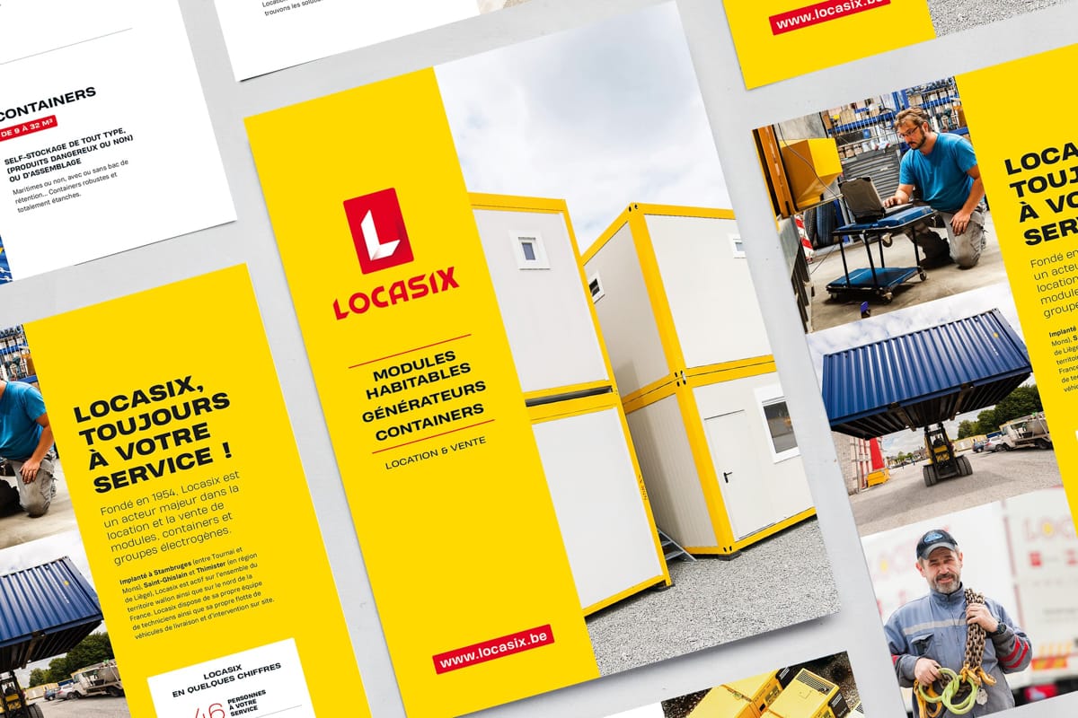
I reworked the logo by simplifying forms and reorganising graphic rhythms. The integrated "L" symbol references both the initial and Locasix's modular solutions: designed by incorporating a modular building in isometric perspective, in negative form. The brand identity is built on a palette of bold colours, blocks whose proportions echo the modular buildings, impactful typography and a content organisation that offers multiple reading levels.
This system is deployed across a variety of materials — vehicle signage, stationery, digital — enabling Locasix to assert its visual coherence and brand maturity while maintaining its historical roots.
Client

Preserving foundations while supporting brand evolution
Founded in 1978 as an equipment rental company, Locasix has established itself as the key player in modular buildings in Belgium, also renting and selling containers and generators. Redesign of the logo and brand identity to support this brand maturity.
The challenge: unifying a wide range of communication materials while respecting the foundations of the historic logo. Evolving the company visually without breaking from its DNA, and integrating a contemporary spatial approach consistent with its current ambitions.
I reworked the logo by simplifying forms and reorganising graphic rhythms. The integrated "L" symbol references both the initial and Locasix's modular solutions: designed by incorporating a modular building in isometric perspective, in negative form. The brand identity is built on a palette of bold colours, blocks whose proportions echo the modular buildings, impactful typography and a content organisation that offers multiple reading levels.
This system is deployed across a variety of materials — vehicle signage, stationery, digital — enabling Locasix to assert its visual coherence and brand maturity while maintaining its historical roots.


