Récit'Cité — Julien Staudt
On Fonts in use
The Mortard neighborhood carries a rich and complex history, in which immigration, intercultural relations, and collective memory are central elements. Julien Staudt conducted a residency there, and over three years, gathered the residents' stories. From this material, he wrote a collection of tales.
My graphic approach was to stay grounded in reality while avoiding prejudices and overly simplistic shortcuts around integration and immigration. I also wanted the book to carry an emotional charge, a certain aesthetic, and an anchoring in reality, memory, and recollection. That it be carried by the residents and that they could recognize themselves in it.
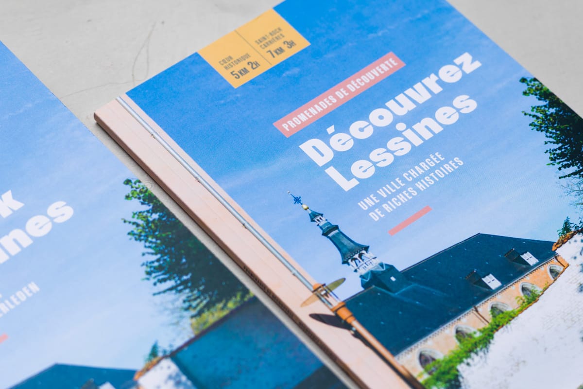
The work involved bringing together heterogeneous material. A dual narrative took shape: text and images move in natural dialogue, yet each follows its own thread. Each chapter opens with a composed page — photographs from the residents themselves, balancing vernacular and intimate images with more descriptive views of the neighbourhood, unified through graphic and colour treatment, anchored by a bold typographic title in a typeface rooted in highway signage — a fitting presence for this particular place. Each image was carefully handled to build visual coherence while preserving what made it real.
The choice of paper — matte, slightly textured, soft to the touch — unifies the whole by creating a common patina that softens contrasts and reinforces the memorial dimension. The format is deliberately modest, fits in the hand, refuses ostentation while affirming its legitimacy.
Client
Memory and imagination of the Mortard neighborhood
Over three years, Julien Staudt gathered the voices of Mortard residents, a working-class neighborhood of tower blocks and social housing, to write a collection of tales — I conceived the book that brings memory and imagination into dialogue.
The Mortard neighborhood carries a rich and complex history, in which immigration, intercultural relations, and collective memory are central elements. Julien Staudt conducted a residency there, and over three years, gathered the residents' stories. From this material, he wrote a collection of tales.
My graphic approach was to stay grounded in reality while avoiding prejudices and overly simplistic shortcuts around integration and immigration. I also wanted the book to carry an emotional charge, a certain aesthetic, and an anchoring in reality, memory, and recollection. That it be carried by the residents and that they could recognize themselves in it.
The work involved bringing together heterogeneous material. A dual narrative took shape: text and images move in natural dialogue, yet each follows its own thread. Each chapter opens with a composed page — photographs from the residents themselves, balancing vernacular and intimate images with more descriptive views of the neighbourhood, unified through graphic and colour treatment, anchored by a bold typographic title in a typeface rooted in highway signage — a fitting presence for this particular place. Each image was carefully handled to build visual coherence while preserving what made it real.
The choice of paper — matte, slightly textured, soft to the touch — unifies the whole by creating a common patina that softens contrasts and reinforces the memorial dimension. The format is deliberately modest, fits in the hand, refuses ostentation while affirming its legitimacy.