IDETA
IDETA supports businesses and investors with real estate solutions, while supporting municipalities in their urban and rural revitalization projects. It also values the tourist potential of Picardy Wallonia through its heritage and landscapes.
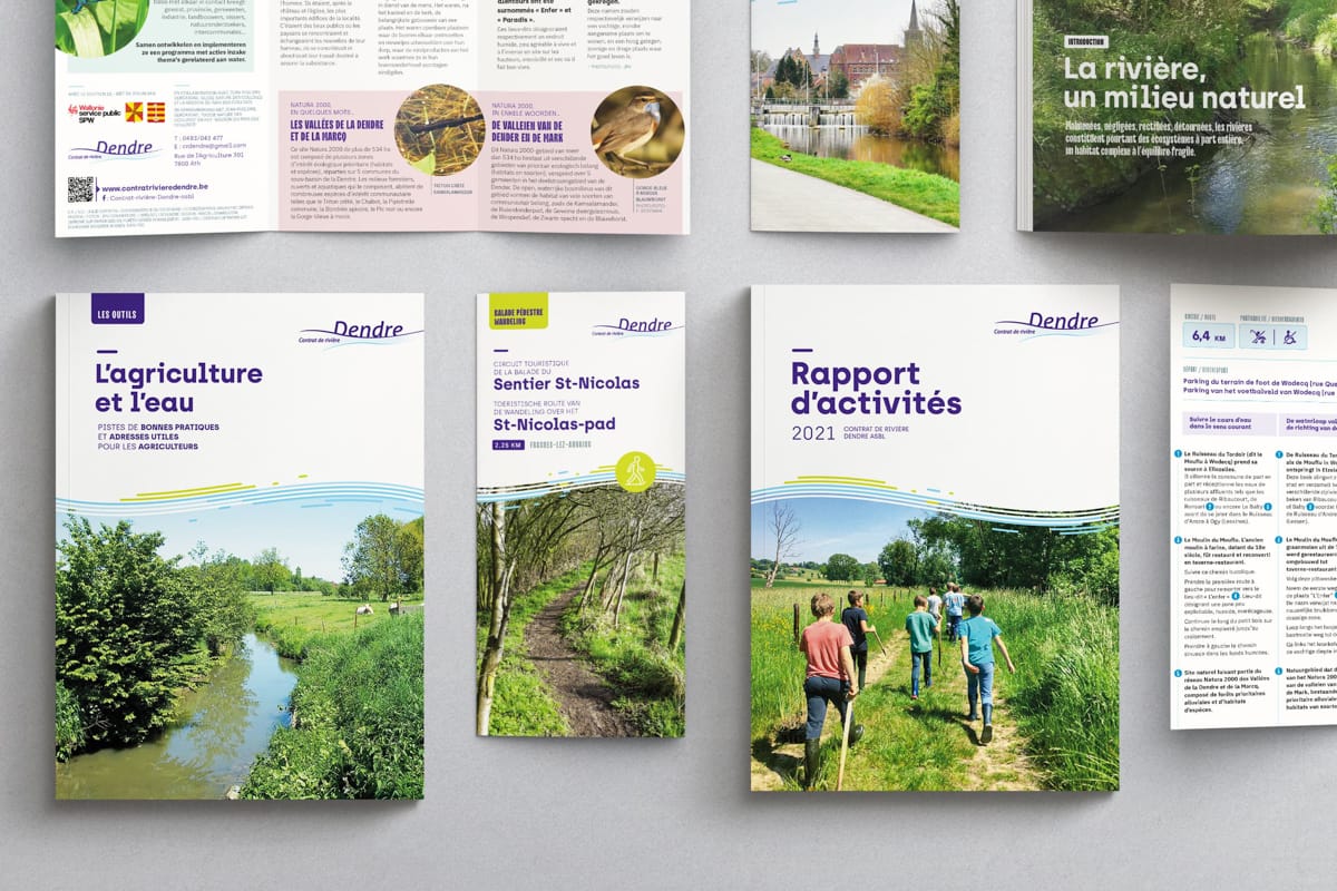
For this project, I built a visual identity for IDETA in a bright, refined and careful approach, where dense content is structured by the management of spaces, white, and punctuated by subtle drops and fine graphic elements or punctual highlights. The spatial organization allows for fluid visual circulation and multi-level reading, promoting both comfort and quick access to key information at a glance.
I optimized the existing logo by adjusting the proportions and spaces and I integrated a system of complementary signatures where each sector (economic, tourist, citizen) benefits from a specific color palette bringing distinction to it while maintaining global coherence. I also designed the graphic system to accompany it with a large number of satellite logos (business parks, related projects...), ensuring homogenization while allowing differentiation of each entity. The iconographic orientation favors authentic and careful visuals and reinforces the perception of quality and proximity.
Client
Supporting the success of projects
The IDETA Territorial Development Agency is the privileged partner of municipalities and businesses and citizens.
IDETA supports businesses and investors with real estate solutions, while supporting municipalities in their urban and rural revitalization projects. It also values the tourist potential of Picardy Wallonia through its heritage and landscapes.
For this project, I built a visual identity for IDETA in a bright, refined and careful approach, where dense content is structured by the management of spaces, white, and punctuated by subtle drops and fine graphic elements or punctual highlights. The spatial organization allows for fluid visual circulation and multi-level reading, promoting both comfort and quick access to key information at a glance.
I optimized the existing logo by adjusting the proportions and spaces and I integrated a system of complementary signatures where each sector (economic, tourist, citizen) benefits from a specific color palette bringing distinction to it while maintaining global coherence. I also designed the graphic system to accompany it with a large number of satellite logos (business parks, related projects...), ensuring homogenization while allowing differentiation of each entity. The iconographic orientation favors authentic and careful visuals and reinforces the perception of quality and proximity.