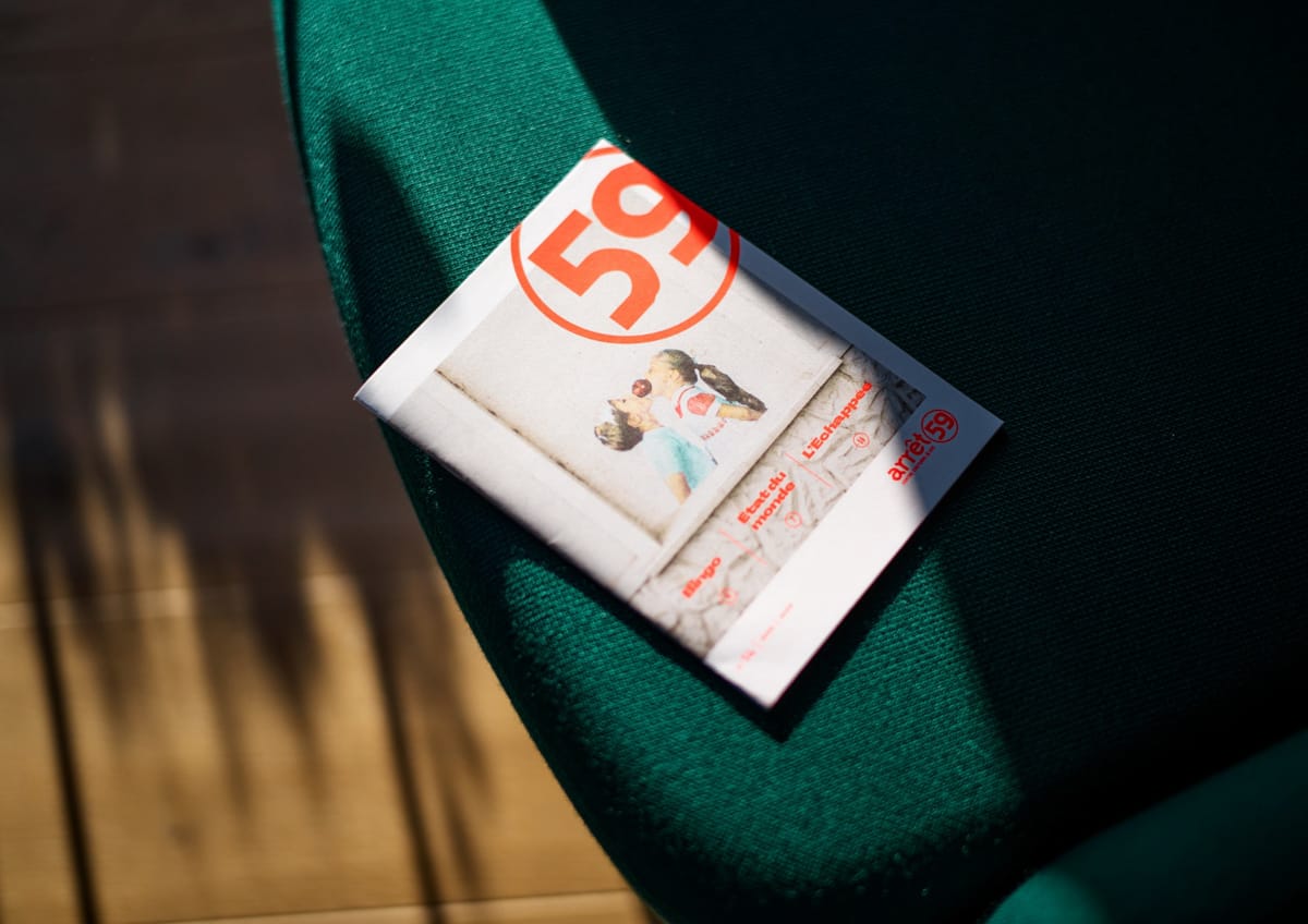
Arrêt 59 — Cultural season 25-26
Arrêt 59, the cultural centre in Péruwelz, presents a dense and varied programme each season, maintaining artistic ambition while never losing connection with its territory and audiences.
Designing the visual identity for a cultural season involves balancing visibility with positioning — the materials must inform, engage audiences, and hold their own within the contemporary visual landscape.
For the 2025—2026 season, I worked with a palette of sharp, acidic tones and unexpected colour pairings that create measured optical tension — a latent irreverence that punctuates the materials and catches the eye. A typographic ensemble that stretches wide, playing contrasts between weight and luminous delicacy, completes the graphic system. The whole is structured through shifts and rhythmic construction that aerate content and convey energy.
This season establishes a new tone while maintaining visual continuity with Arrêt 59, preserving core visual elements and principles such as subtle, vibrant colour treatment and an openness and care towards its audiences.
The system is designed as a modular kit: each element combines, adapts, and works across different formats. Structured to endure, the Arrêt 59 team takes ownership of it to bring the communication materials to life throughout the season.
Client
Positioning culture as a necessity
Arrêt 59 presents dynamic, high-quality programming with a strong societal commitment, striving to provide access to culture in a region where it is not always a given. For over a decade, I have designed the visual identity for each season, creating graphic systems that evolve while remaining recognisable.
Arrêt 59, the cultural centre in Péruwelz, presents a dense and varied programme each season, maintaining artistic ambition while never losing connection with its territory and audiences.
Designing the visual identity for a cultural season involves balancing visibility with positioning — the materials must inform, engage audiences, and hold their own within the contemporary visual landscape.
For the 2025—2026 season, I worked with a palette of sharp, acidic tones and unexpected colour pairings that create measured optical tension — a latent irreverence that punctuates the materials and catches the eye. A typographic ensemble that stretches wide, playing contrasts between weight and luminous delicacy, completes the graphic system. The whole is structured through shifts and rhythmic construction that aerate content and convey energy.
This season establishes a new tone while maintaining visual continuity with Arrêt 59, preserving core visual elements and principles such as subtle, vibrant colour treatment and an openness and care towards its audiences.
The system is designed as a modular kit: each element combines, adapts, and works across different formats. Structured to endure, the Arrêt 59 team takes ownership of it to bring the communication materials to life throughout the season.