Discover Lessines
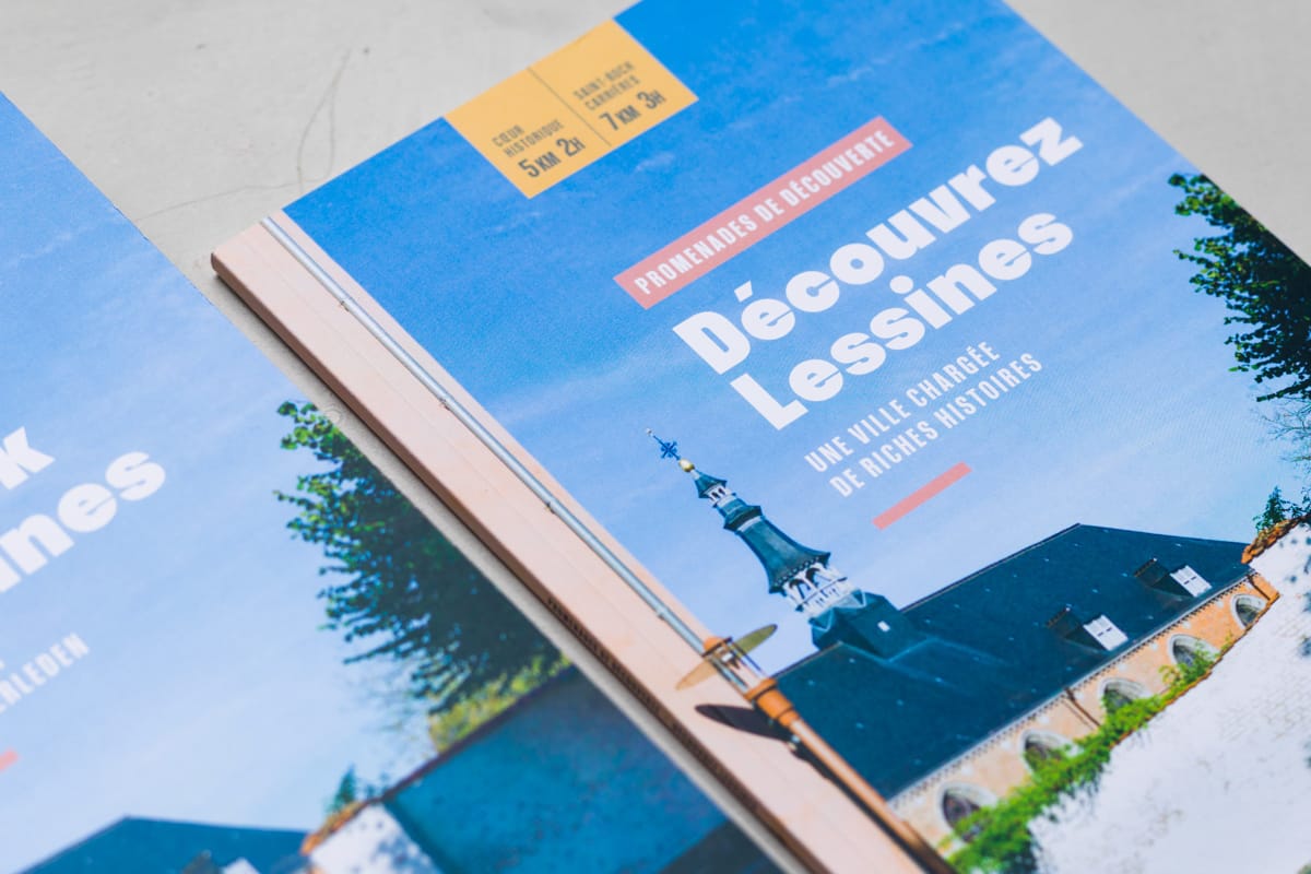
This 54-page book, an initiative of the Hôpital Notre-Dame à la Rose de Lessines, offers an immersion in the heart of the city through two routes. These itineraries reveal the history of Lessines and highlight its many characters, from Alix de Rosolit to René Magritte.
My role was to transform a set of raw contents into a finished object, from structuring and prioritizing, taking photographs, arranging pages and cutting them into a multi-level reading.
A play on colors, spaces, margins, rhythms, and the arrangement of images and illustrations creates an interesting and balanced layout that is both consistent with the city's historical past and a contemporary layout.
The typographical choice also reflects this duality: a main typeface that draws its form from historical roots but from a contemporary, extremely fine and colorful visual treatment. The use of fresh colors, combined with a set of typographic sizes, columns and highlights builds a visual rhythm that accompanies the reader throughout the journey. I also designed an illustrated map, spread over a double flap in an effort to optimize ergonomics and readability.
Client

A city steeped in rich stories
Lessines discovery walk book.
This 54-page book, an initiative of the Hôpital Notre-Dame à la Rose de Lessines, offers an immersion in the heart of the city through two routes. These itineraries reveal the history of Lessines and highlight its many characters, from Alix de Rosolit to René Magritte.
My role was to transform a set of raw contents into a finished object, from structuring and prioritizing, taking photographs, arranging pages and cutting them into a multi-level reading.
A play on colors, spaces, margins, rhythms, and the arrangement of images and illustrations creates an interesting and balanced layout that is both consistent with the city's historical past and a contemporary layout.
The typographical choice also reflects this duality: a main typeface that draws its form from historical roots but from a contemporary, extremely fine and colorful visual treatment. The use of fresh colors, combined with a set of typographic sizes, columns and highlights builds a visual rhythm that accompanies the reader throughout the journey. I also designed an illustrated map, spread over a double flap in an effort to optimize ergonomics and readability.


